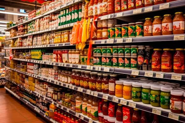
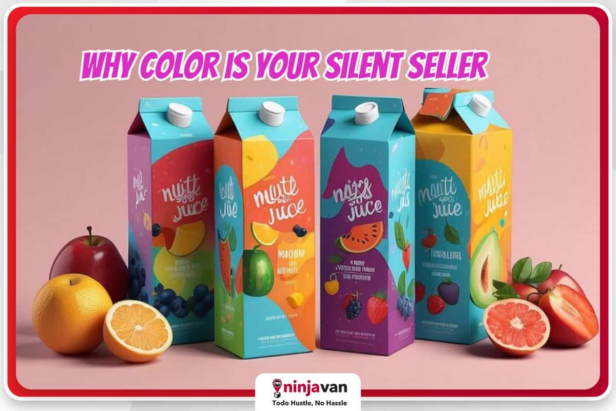
In a crowded marketplace, product packaging is a silent salesperson. It has mere seconds to grab a customer’s attention, convey brand identity and spark a purchase decision. One of the most powerful tools in a designer’s arsenal for achieving this? Color.
Color psychology delves into the fascinating connection between color and human emotion. Studies suggest that up to 90% of snap judgments about products are based on color alone. So, understanding how different colors influence perception is crucial for creating packaging that resonates with your target audience.
Also read: What Your Brand Colors Say About Your Business
Why using color psychology is important in product packaging design
Color psychology is crucial in product packaging because it’s a silent persuasion tool. Here’s why:
- Grabs attention. Color is the first thing we notice, so it instantly grabs a shopper’s eye on a crowded shelf.
- Sparks emotions. Different colors trigger specific feelings. By choosing the right color, you can influence how consumers feel about your product.
- Shapes brand identity. Consistent color use across packaging builds brand recognition. Boosts sales: Choosing colors that resonate with your target audience can lead to more purchases.
#NinjaTip: Make sure your store shelves are always well-stocked while keeping your costs low. Ninja Restock is a pay-per-space restocking solution allowing smaller loads but frequent deliveries. Get a faster way to transport your stocks or inventory from warehouse to store. Learn about Ninja Restock today!
Color psychology in marketing
As a marketer, you must understand how colors trigger emotions and influence buying decisions. Use this knowledge to choose colors that align with your product and resonate with your target market.
By using color strategically, packaging can silently sell and build brand recognition.
Color evokes emotion
- Red. Excitement, passion, boldness. Think of the energy of a Coca-Cola can or the urgency of a clearance sale sign.
- Orange. Cheerfulness, warmth, affordability. Orange packaging can suggest a fun and approachable brand.
- Yellow. Optimism, energy, clarity. Yellow is a great choice to convey a sense of happiness and creativity, as seen in the packaging of children’s toys like Legos.
- Green. Peace, growth, health. Green is often used for organic products or those associated with nature and wellness.
- Blue. Trust, security, reliability. Blue is a go-to color for tech brands and financial institutions, conveying a sense of stability and professionalism.

Beyond the basics
While these are general associations, remember that color is nuanced. A pale blue evokes calmness, while a vibrant blue can project energy. Similarly, a deep red might suggest luxury, while a bright red screams for attention.
Understanding these variations allows you to create targeted messaging.
Targeting your audience
Consider your ideal customer. Are they young and trendy? Sophisticated adults? Certain colors might resonate more with specific demographics. For example, studies suggest that men tend to favor blue and green, while women might be drawn to purple and red.
Again, these could be generalizations. Create a customer persona to create more color on-point strategy.
Building brand identity
Color is a cornerstone of brand recognition: Think of the iconic yellow of a McDonald’s arch. Consistent color use across packaging creates a visual language that consumers can easily identify and associate with specific values.

Embrace product design psychology to boost your sales
Color is a powerful tool in a designer’s toolbox. By understanding the psychology of color and how it influences consumer perception, you can create product packaging design that speaks volumes, even before a word is read.
So the next time you design packaging, consider the silent message your colors are sending.
More branding tips for your business:
Branding Lessons from Top Fashion Brands
Build A Community Around Your Brand
How to Build Your Brand through Vlogs


