Colors play an important role in marketing.
When designing the logo and branding your business, colors are always a big part of the discussion. This is because colors are the first things your target audience notices or remembers when they think of your brand.
Therefore, brand colors play a significant role in consumer behavior.
For example, when you think about Facebook, you think blue. Their logo and website are blue; in fact, their website is full of blue accents. Blue is part of the user experience.
When you think of Starbucks, meanwhile, you think green. Green is everywhere in any Starbucks store — from their cups and employee uniforms to their apps and website.
Color is a great brand identifier, which is why you should take your brand colors seriously.
The top brand colors and their meaning

There are two main palettes: cool (purples, greens and blues) and warm (oranges, yellows and reds). Cool colors represent emotions of serenity, peace and maturity while warm colors denote feelings of passion, friendliness and creativity.
But how do popular brand colors affect customers and what do they mean for your brand? Here’s an overview.
Red
This is the color of power. It catches people’s eyes and holds their attention, which is why red is a popular marketing color. You’ll notice that the word SALE is always in red.
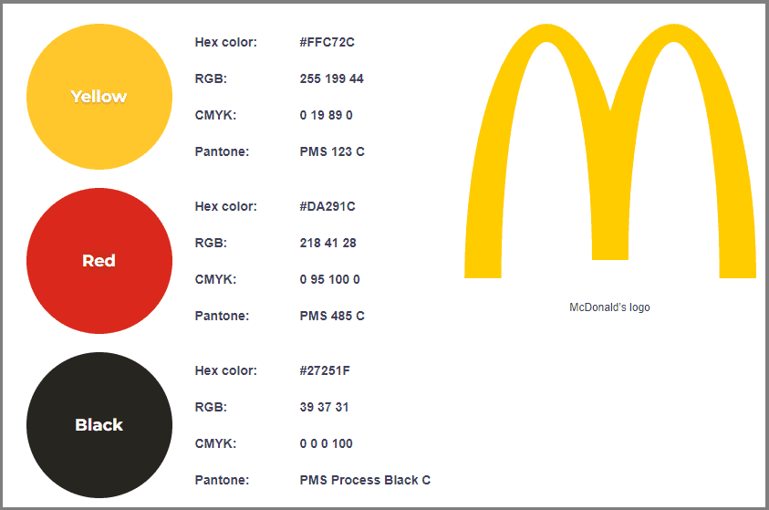
Also, this color stimulates appetite. This explains why many fast-food restaurants — like Pizza Hut, KFC and Jollibee — use red in all of their branding materials.
Blue
Known as the king of colors, blue is a common contender for brand colors. It’s a relaxed hue that encourages customers to view brands as cool and trustworthy.
It also puts people at ease and reminds them of the ocean or skies. Blue is the color of choice for big brands like Visa, Facebook and Unilever.
Yellow
Brands that want to evoke a positive feeling in their identity often incorporate yellow in their logos and branding materials. Yellow also stands out among other colors, which makes it an appealing and creative hue. Brands use yellow to command the attention of their market.
Green
Green is associated with freshness, health and growth. These positive attributes make this a popular color for food brands — think Subway and Starbucks.
It’s also the color used for brands that promote organic and eco-friendly or green practices.

White
White represents cleanliness, purity and simplicity, making it a popular color in the cleaning business, healthcare sector and child-related businesses. White also brings out the feeling of trust and efficiency.
Orange
Orange is an energetic color perfect for brands that want to combine the brightness of yellow and the passion of red. It’s a cheerful and creative shade that evokes adventure. It can also make customers feel they’re dealing with a cutting-edge business.
Pink
Pink is a feminine color, which is why it’s often used in products for women. The color also exudes youthfulness, sensitivity and beauty.
Black
Another popular branding color, black is sophisticated, classic and versatile. It can be relaxing or exciting, traditional or modern. Black is often used as a contrasting color since it adds drama to whatever mood you want.
Some of the most popular luxury brands in the world use black as a primary branding color. This list includes Armani, Dior, Prada, Michael Kors and Chanel.
How To Choose Brand Colors

Image from Getty Images
With so many colors to choose from, how do you decide which one to use for your brand? Can you just randomly select a palette on Canva and be done with it?
To simplify the process, keep the following tips in mind.
It should only be three colors
In conversations about brand colors, you’ll need the following: a base, an accent and a neutral. Most brand color schemes can have between one to four hues. But even if you prefer a monochromatic approach, you’ll still need different shades for different purposes.
Base. When choosing the base, consider the most important trait of your brand. The base color should reflect this. It will also determine how the remaining colors should match it.
Accent. The accent color is the shade you use most after the base. Choosing an accent color is trickier since there are more limitations. Apart from matching your brand’s personality, the accent should also match your base color.
Neutral. The neutral color is your background color, aka the one you choose to avoid attention. Neutral colors are often different shades of gray, but whites, off-whites and beige also work. You can also use black, but it can dominate other color schemes.

It should represent your business’s personality
Color is a subjective topic, but it can elicit emotion. What do you want to say about your brand? If your business is about sophistication and simplicity, consider muted tones.
On the other hand, if your brand is all about fun and adventure, bold and bright colors should be part of your palette.
Before designing your logo, decide on the personality of your business as that will decide your brand colors.
It should appeal to your customers
As a brand, you know who you are and you know your goals. But do you think about the people you’re trying to reach? Which colors do your target audience gravitate to?
For instance, if you’re serving food, red might be good since red entices appetites. If you’re selling toys, an all-black color branding scheme isn’t ideal, but it works for a luxury men’s fashion line.
Ready to choose your brand color?

Image from Unsplash
Choosing your brand colors should never be driven by personal tastes or whims; it should consider your business’s value, enable greater awareness and support your brand positioning.
When you choose the right colors, your business will be memorable to your customers.


