If you’ve been spending a good chunk of your day answering order queries and decoding online shopping lingo (Hm? PM? LP? Avail? RFS?), it’s probably because your customers don’t have a good sense of what you’re trying to sell.
They want to completely understand what they’re committing to before purchasing. Why? Consider what you take away from them when they shop online: they can’t see, feel or try your products. Unlike in-store shopping, customers have to rely on the information you give on your page before clicking “Add to cart.”

You might be thinking of an info-loaded social media, ecommerce or web page post that might drive your buyers away. What’s the sweet spot that paints the right product picture then? A well-designed product page is the answer to your woes.
A carefully designed product page is proven to increase sales. With online shopping in the Philippines at an all-time high, this is another element in your artillery that will level up the shopping experience and set you apart from your competitors.
Let’s take a look at the building blocks of a brilliant product page to get you started!
Part 1: Product information your customers want to see
Before we head to the specifics of how to list and lay out your product page, first thing’s first: you must understand your target audience.
When they message you, what are the usual queries they raise about your products? Where else do they shop, and how do successful brands like yours cater to them?
Don’t hesitate to get their feedback to help you improve your services. Run a survey on how they want their shopping experience to be, or casually ask them what they wish to see on your product page. Use the information as your guide for the anatomy of your product page.

Now that you have the foundation covered, let’s go to the nitty-gritty details of what makes a product landing page effective.
Product name
You want to make sure that you’re using the right keywords for your product so potential customers can find your offerings when doing a search online.
Start with using a keyword planner. You can use this tool to find SEO-friendly keywords and also see how competitive those keywords are. Doing this will help improve your SEO ranking on search engines.
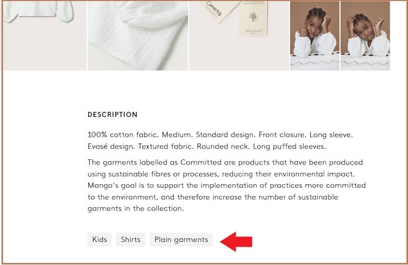
On the page itself, you can add related tags to further organize customers’ searches. For example, if they search for “shoes,” all products tagged with “shoes” will appear on the results page. You can also make the name descriptive, memorable and unique. Avoid using the same-sounding names within the catalog to clearly distinguish between products.
#NinjaTip: Are you having a hard time coming up with interesting product names? Try name generators like this and incorporate the keywords from your planner.
Good images
Customers will rely on images even if you have descriptive product information. About 88% of customers in this survey consider clear product images as a key element of the shopping experience.
You don’t need a professional photographer for this, but you need to add high-quality images that will help customers visualize the product. You can also use images to show different angles of the product, or to show how the product is used.
Use multiple photos to show the product in different contexts. For example, if you’re selling clothing, you can use an image of the dress on a model, on a hanger, and being worn. This will help customers get a better sense of what the product looks like and how it might fit them.
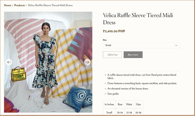
#NinjaTip: A good product image supports your brand as a whole. Add elements that communicate your persona. Use tools to help style and enhance your images and enhance them for better appearance. Don’t clutter your page with photos, too. Use gallery view and zoom options to keep it organized.
Product description
When customers are scrolling through search results, they can judge your product page by its cover, so to speak. So it’s best to include informative and appealing product descriptions to help you stand out from the competition.
You don’t need to (and you shouldn’t) make product descriptions fancy. Use general information about the product, like its features, and what problems it solves. Highlight its benefits and show how they’re relevant to the customer.
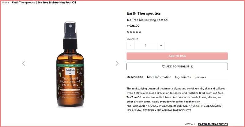
Product descriptions should be easy for both humans and search engines to digest. Use a conversational tone, but don’t lose focus on the product details. Give time to write and edit product entries because it’ll pay off: 82% of customers read product page details.
And keep it short, too — your goal is to make it informative enough for the next step: convincing prospective buyers to click ‘add to cart.’
#NinjaTip: Err on the side of brevity when writing your product description. Keep sentences short, simple, skimmable and easy to read. Use bullet points, headers, paragraph breaks and readable fonts to make information digestible.
Product price
Customers like to see the price upfront. When they can’t find it, they’ll often leave the page without taking any further action.
And yet, many local online sellers fail to add prices to their product descriptions, especially on social media (is PM really key here, folks? DTI thinks otherwise).
These online shops may choose not to display prices to avoid low-ball offers. But this can actually hurt sales. It’s better to be upfront about the price and let customers make an offer if they’re interested.
#NinjaTip: Add the price near the buy or order button so that customers naturally gravitate towards clicking that.
Order button
When it comes to the order button, you want it to be as visible as possible. This means putting it where customers can see it without scrolling down. It’s also a good idea to make the button big and easy to click.
In addition, make sure the text on the button is clear. Use words like “buy,” “add to cart” or “order” so that customers know what they need to do.
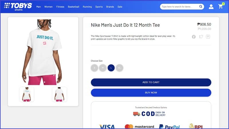
Finally, you might find that a different color or design works better than your original button. Try A/B testing different buttons to see which one converts the best.
#NinjaTip: The button should lead to a page with clear transaction options. Detail your online payments or ewallets. If you offer COD, add that too. Make sure your website is secure and the API reliable to navigate between applications, avoid lag and bypass transaction issues.
Shipping and return policies
Including shipping and return information on your product page is important because it helps build trust with your customers. When customers know what to expect when they order a product, they’re more likely to complete the purchase.
Additionally, they’ll know what the return process is if something goes wrong with their order. This makes it easier for them to get a refund or exchange the product.
#NinjaTip: Reliable delivery solutions have dashboards you can integrate into your ecommerce site. Delivery trackers aren’t only convenient for your buyers, they also lessen delivery inquiries (hassle-free for you and your customers).

Other elements
You’ve covered the basics, but you can still make your product page more useful by adding customer reviews, product videos, product quantity options and a wishlist button for out-of-stock items.
These paint a better picture of what you’re selling, help build trust with customers, provide information about the product and make it easier for customers to buy it. Businesses can increase sales and create a better customer experience by including these elements.
#NinjaTip: A wishlist option is a good way to build your customer information database. You can send an email to them once the product is ready, which adds to engagement and customer service. Have the wishlist button route to a signup or email list page along with a few vital information fields you may need to know about your customer.
Part 2: Let’s tackle product page design
Product page design should be given the same attention as you would think about designing your store layout.
It’s not just about communicating your brand persona. You want to have your offerings organized, properly spaced and with a good flow that leads your customers from window shopping to lining up at the cashier.
Mood, music, and lighting play their part, just like your webpage’s layout, colors, images and fonts.
A good design makes it easier for customers to navigate the page and find the information they need. It also makes the page look professional and trustworthy. Customers who feel confident about the business are more likely to buy from them.
We’ve prepared a cheat sheet for you! Download your Anatomy of a Good Product Page guide below:
Design improves the customer experience. Product pages that are easy to use and easy on the eyes convert onlookers into buyers.
Here are a few things to consider when designing your product page.
Design for mobile
Smartphone shopping is at a historic high. 52% of Filipinos in this survey use mobile or smartphones to shop. Your product page must be responsive and work well across devices, highlighting important elements like bigger order buttons when the design shifts to mobile.
Make navigation clear
Think about the customer experience when planning the page’s navigation. Organize categories, lessen scrolls, add buttons to go back to certain pages (ex. back to top), and strategically place elements like videos or customer reviews.
Choose a clean design
Make it easy for customers to find the details they need when they visit your page, including:
- Tab content
- Image gallery views
- Content sections
- Drop-down tabs
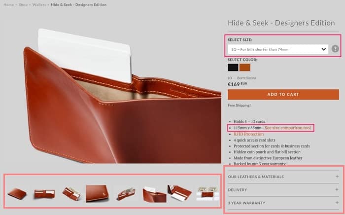
Feature pertinent information first and offer sections that expound on descriptions. Interested buyers would want to learn more, but they don’t want to be bombarded with so many details.
Just as they don’t want an eager sales representative following them around a physical store, your product page can provide extra information under strategically placed drop-down menus or buttons to avoid info overload.
Manage your pop-ups
Add value to your pop-ups. Knowing that Filipinos are bargain hunters, the drive is to have your customers make a purchase (right now or in the near future), so pop-ups on coupons and subscription options are helpful.
Keep other announcements on your social media pages and email newsletters.
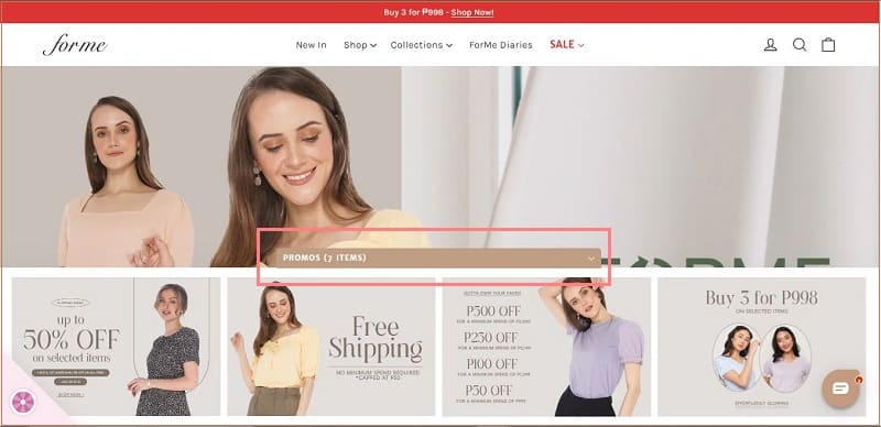
#NinjaTip: Use ecommerce website builders like Shopify, Sentro or AppiGo and worry less about paying a designer or studying the best design trends and tools to incorporate into your page.
Create a hard-working product page
You need to stand out in a sea of rising online competition. A well-designed product page can do that for you, and it goes a long way in increasing sales.
Putting the effort into designing your page delights your customers, improving service and experience that translates to business continuity. An effective product landing page is also crucial to your digital marketing strategy.
Ready to transform your product page? With great product page examples and our cheat sheet, you’re ready to design a product page that will entice your customers to buy.
Let this list be your ultimate guide!
Featured image by JuliaTim via Getty Images

